Replacing Gotham with a proprietary typeface across the entire Glovo ecosystem
How I led a typeface redesign programme across five scripts, from selecting the type foundry to shipping, while embedding it into the build of a unified Design System.
Ingredients
A licence renewed at high cost, year after year
Glovo delivers on demand across 25+ countries. Since its early days, the company had used Gotham (a commercially licensed typeface) across all its products: customer apps, courier apps, partner platforms, websites, internal platforms, and marketing content.
The annual cost of that licence ran into several hundred thousand euros. And every year, the dependency renewed itself.
My manager defended the project at the executive committee, drawing on an initial market benchmark. I refined that benchmark and led the programme execution. The financial case was clear: buying a bespoke typeface costs less as a one-time investment than renewing the licence for a single year. Return on investment in under twelve months.
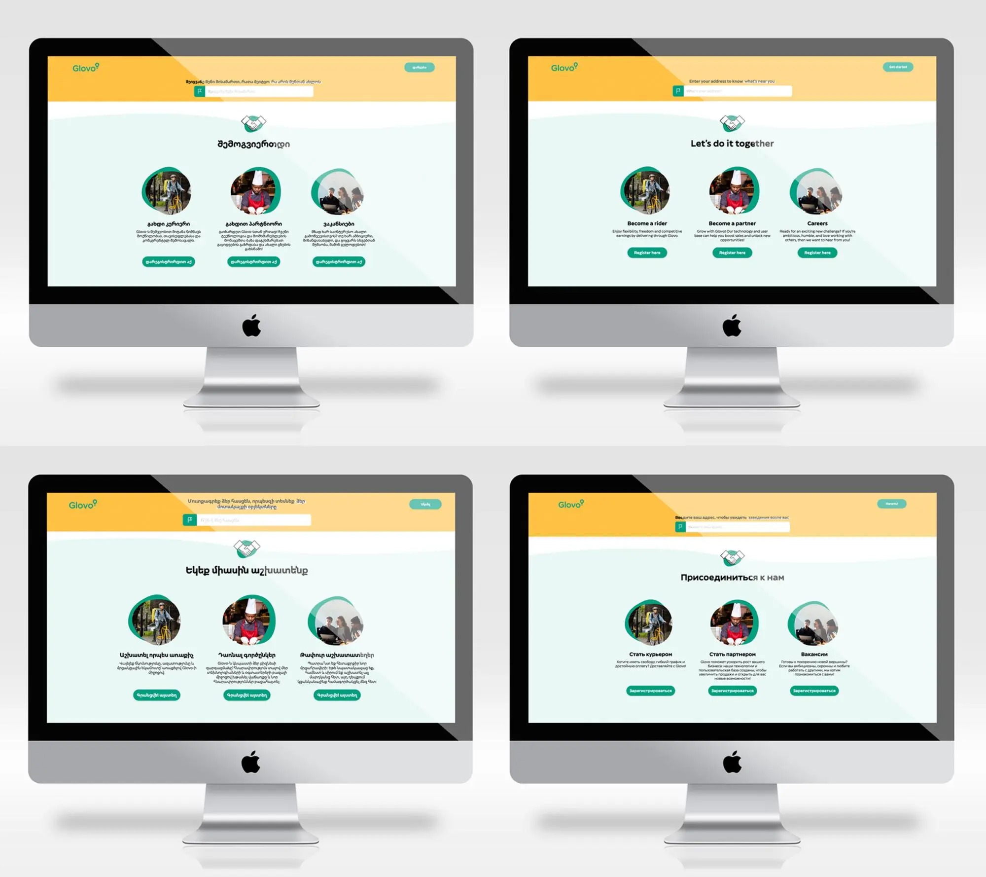
The ambition went beyond cost savings. Glovo wanted a distinctive typographic identity, capable of carrying the brand across five writing systems: Latin, Cyrillic, Arabic, Armenian, Georgian. One visual voice across its entire geographic footprint.
Three priorities, held at once
Brand wanted a distinctive identity. Engineering wanted zero code changes. Marketing, brand & design wanted zero visual regression. Three directions, one programme.
A real personality
The new typeface had to carry the brand's character. The brief came down to three words: human, welcoming, contemporary.
Zero impact on product teams
No code migration to run alongside their roadmaps. The new typeface had to slot in without breaking any interfaces.
No visible regression
No perceptible visual break for users. And one hard deadline: removing Gotham from all Design and marketing content before the licence expired.
These three priorities pulled in different directions. A distinctive typeface for Brand, design & marketing could force adjustments for Engineering. A typeface with metrics mirroring Gotham's could disappoint Brand. Managing that tension was the job.
Four interlocking dimensions
I joined the project as Design Ops Lead for the programme. A Technical Program Manager handled delivery on the Engineering side. My scope covered four dimensions.
-
Selecting the type foundry
(A type foundry is a studio that designs and distributes custom typefaces.) I aligned Brand, Design, Engineering, Marketing, and Procurement to draft a shared typographic brief. I sent it to 19 shortlisted foundries. 12 responded. I built a comparison framework across four objective criteria: typographic fit, creative capabilities, technical and delivery capacity, cost. I ran the negotiations, organised presentations with a shortlist of finalists, managed NDAs and quotes. I supervised the contracting phase, in coordination with my manager and the Head of Procurement.
-
Design Ops coordination
Consistency of deployment across Glovo's three Design Systems (customer, courier, partner) and facilitation of internal designer reviews at each milestone. I managed typeface updates and woff file additions in Figma as the deployment progressed. Coordination with the Zeppelin programme I was leading in parallel.
-
Coordinating Brand, Marketing, and local markets
Mobilising the Global Brand Design Manager, coordinating with the Lead Video and Senior Designer for Design and marketing content, and addressing linguistic requirements by country.
-
Overseeing the foundry on two levels
On the creative side, I consolidated feedback from internal designers, flagged glyph or proportion issues, and approved proposals at each milestone. On the administrative side, I approved purchase orders, tracked contractual deliverables, and held the pace across the five phases.
The two committees
I facilitated and organised the Creative committee (around twenty people). This committee approved typographic choices. I participated in the Technical implementation committee (around ten engineers and an Engineering Manager), where I represented the Design and Brand perspective while the Technical Program Manager facilitated.
Slice, sequence, ritualise
I structured the programme around three principles.
Sequence by script, not by product
The mistake would have been to ship everything for one product first, then move on. That would have created visual inconsistencies across products for months. Instead, we shipped each script across all products at the same time, starting with Latin.
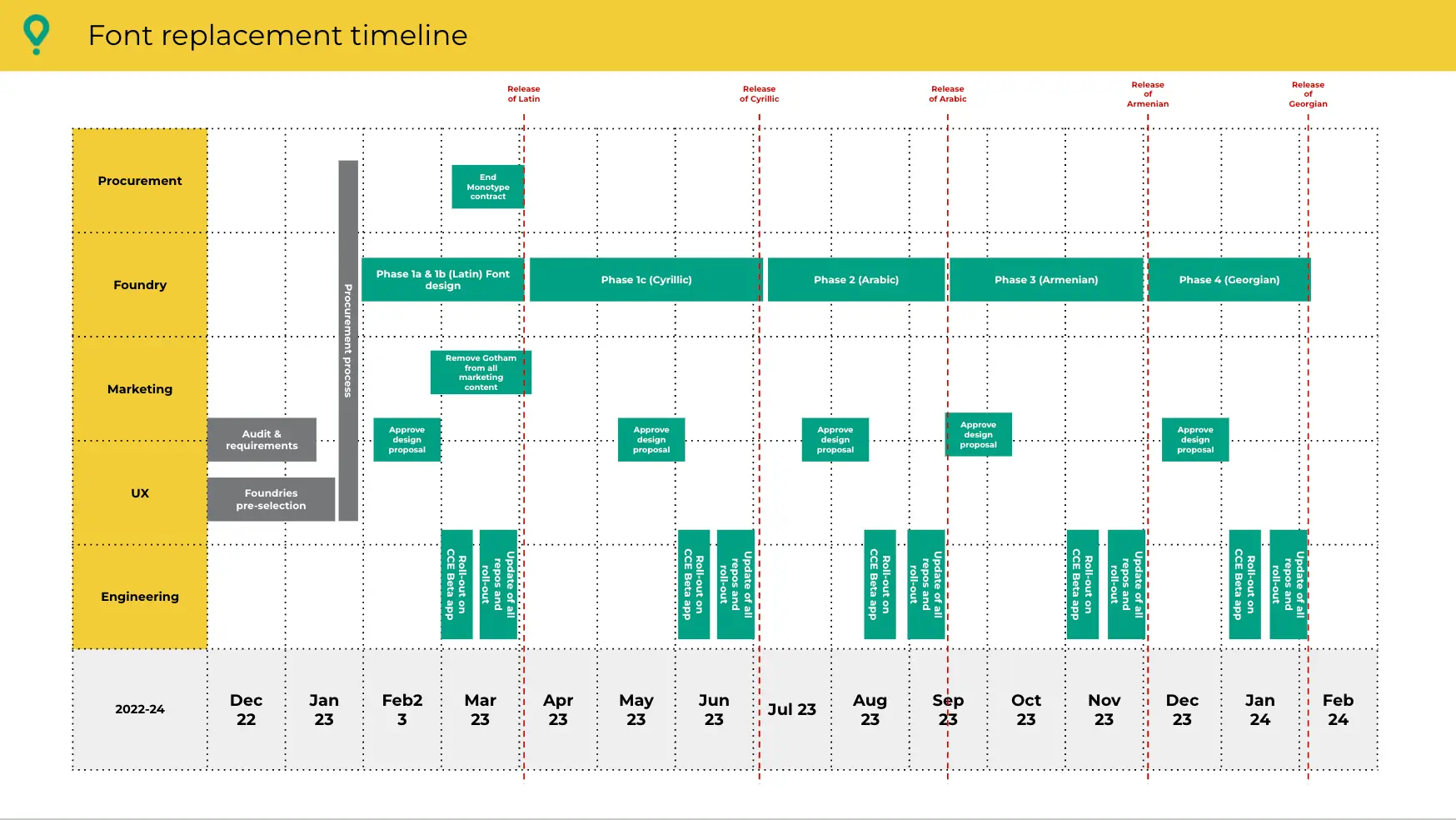
Protect the committee rhythm
Every phase followed the same cycle: design proposal approval, beta rollout on the courier app, official release, update of all repositories. That rhythm held across all scripts. It made the programme legible for Engineering, predictable for Marketing, Brand and Design, and manageable for the foundry.
Bring in expert consultants
Letterjuice (the selected foundry, based in Barcelona) brought in two external consultants: Gor Jihanian for Armenian, Ana Sanikidze for Georgian. A decision I supported from the start. It avoids projecting Latin conventions onto writing systems that work differently.
Six phases, six different challenges
-
Phase 0 · Dec 2022 to Feb 2023
Selecting the foundry
Scoping requirements with all internal functions. Brief sent to 19 shortlisted foundries. 12 responses. Objective comparison across four criteria: typographic fit, creative capabilities, technical and delivery capacity, cost. Negotiations, presentations with a shortlist of finalists. Contract signed with Letterjuice.
-
Phase 1 · March 2023
Latin
The structuring script. The one that sets the vertical metrics every other script would align to. A few Barcelona-specific cultural adjustments were integrated at this stage, because Barcelone is where both Glovo and the foundry are headquartered. Gotham was removed from all Design and marketing content in parallel.
-
Phase 2 · June 2023
Cyrillic
First round of visual proportion negotiations. Alternates added for Bulgarian and Serbian, specific glyphs for Kazakh and Kyrgyz.
-
Phase 3 · July 2023
Arabic
The most structurally complex challenge. Arabic has very different proportions from Latin and reads right to left. Close coordination with Engineering teams on bidirectionality support.
-
Phase 4 · September 2023
Armenian
First script handled by an external consultant (Gor Jihanian). Proposals validated by local market leads in Armenia for readability.
-
Phase 5 · Milestones set before my departure
Georgian
I scoped the phase and set the key milestones. Day-to-day oversight was handed to my successor after my departure in November 2023. The complete typeface was delivered in February 2024.
Five angles
ROI in under a year
A recurring cost of several hundred thousand euros per year turned into a one-time investment below one hundred thousand euros. Return on investment reached in under a year, demonstrated as early as the foundry selection phase.
A typeface we own
Glovo now owns its typeface, Glovo Sans. No licence to renew, no external dependency on a core brand asset.
20+ repositories updated, no code changes
Deployed across 20+ code repositories, with no visible regression for users and no migration work for product teams. The promise of a well-tokenised Design System delivered in practice. This would not have been possible without Zeppelin, Glovo's Design System.
One voice across 5 scripts
A typographic identity that belongs to Glovo, true to the human, welcoming, contemporary brief, and capable of carrying the brand across five scripts with a unified voice.
Milestones held, phase after phase
Milestones held phase after phase, with a seamless transition from the old typeface to the new one.
What the people who made this project with me have to say
Testimonials to come, collected from people involved in the programme.
What I would do differently
Consulting local markets earlier
Every proposal was validated by local market leads, mainly for readability. That was useful, but focused on final sign-off. With more time, I would have consulted markets earlier to gather ideas for cultural adjustments (shapes, proportions, local references) before the design phase. We did this in Barcelona, because that is where both Glovo and the foundry are based, but that case is particular. Extending the method to other markets could have enriched the creative brief.
Capturing decisions more rigorously from the start
The committee rhythm was manageable. But some key decisions required back-and-forth that a more structured format could have avoided. For instance, a one-page summary per committee with two options presented, one decision recorded, one sign-off. That is an improvement I applied to other programmes afterwards.
Structuring handover from day one
My departure was planned, but the Georgian phase handover happened in the final weeks, which required an intense burst of retroactive documentation. A roadmap with milestones existed in Confluence, but there was no documentation on how to run the programme, which would have made handover possible at any point in the project. If I were running a long programme again, I would build a living handover document from the start, updated monthly, rather than producing it at the end of the engagement.
Programme co-led with a Technical Program Manager on the Engineering side. Typeface design: Letterjuice (Barcelona), with the consultancy of Gor Jihanian (Armenian) and Ana Sanikidze (Georgian). Internal Glovo committees: Design, Brand, Engineering, Marketing, and Procurement teams.
The complete story of the typeface design, from the foundry's perspective, is documented at letterjuice.cat.
Interested?
Do you have a cross-functional programme to run, a vendor dependency to untangle, or a Design System to turn into a cost lever?
30-minute discovery call, free, no strings attached.
Book a slot